Overview
At Playtech, I had the invaluable opportunity to validate and implement ideas that improved internal processes and contributed to the development of competitive, user-focused products. Shortly after joining Playtech Shortly after joining in August 2012, I was entrusted with leading the UX/UI design for a pioneering SaaS-responsive bingo platform, replacing the outdated Flash-based desktop version and expanding accessibility across multiple devices. My role involved conducting user research and collaborating with Product Managers and Business Analysts to shape a user-driven design strategy. I designed the platform's UI, established branding guidelines for seamless third-party customization, and drove continuous product innovation by leveraging UX insights, market trends, and emerging technologies. Additionally, I actively participated in Agile development processes to ensure iterative improvements aligned with business objectives. This project not only modernized Playtech's offerings but also showcased the transformative power of design thinking in delivering impactful, scalable solutions.
The Challenges
We encountered several challenges throughout the project, but ultimately, our efforts paid off, resulting in a market-leading product.
Not mobile First: Since a revenue-generating native mobile app was already in
place, the initial focus was on transforming the tablet and desktop UIs. Once the HTML5 product was fully
developed, the mobile app was also transitioned to HTML5 and integrated into a unified codebase with the tablet
platform.
Development Team: Most of the development team had expertise in Flash, making the
shift to HTML5 a significant hurdle. To ease the transition, the first template was initially built in Flash
before moving fully to HTML5.
Existing Users: Desktop users were accustomed to the rich, Flash-based UI, so the
new interface had to be intuitive, visually appealing, and introduced gradually to ensure a seamless
transition.
Branding: The previous UI was complex to brand and required in-house updates at
Playtech, leading to extensive collaboration between the design team and clients. The new UI addressed this by
introducing customizable templates and clear guidelines, empowering clients to manage their branding
independently.
UX culture: Flash Player and native products previously had limited support for UX
design principles. However, with the transition to a unified codebase, it became easier to track user behavior,
implement improvements, and test changes across devices. As UX enhancements proved to boost ROI, a dedicated UX
backlog was incorporated into sprint cycles, fostering a stronger UX culture within the development process.
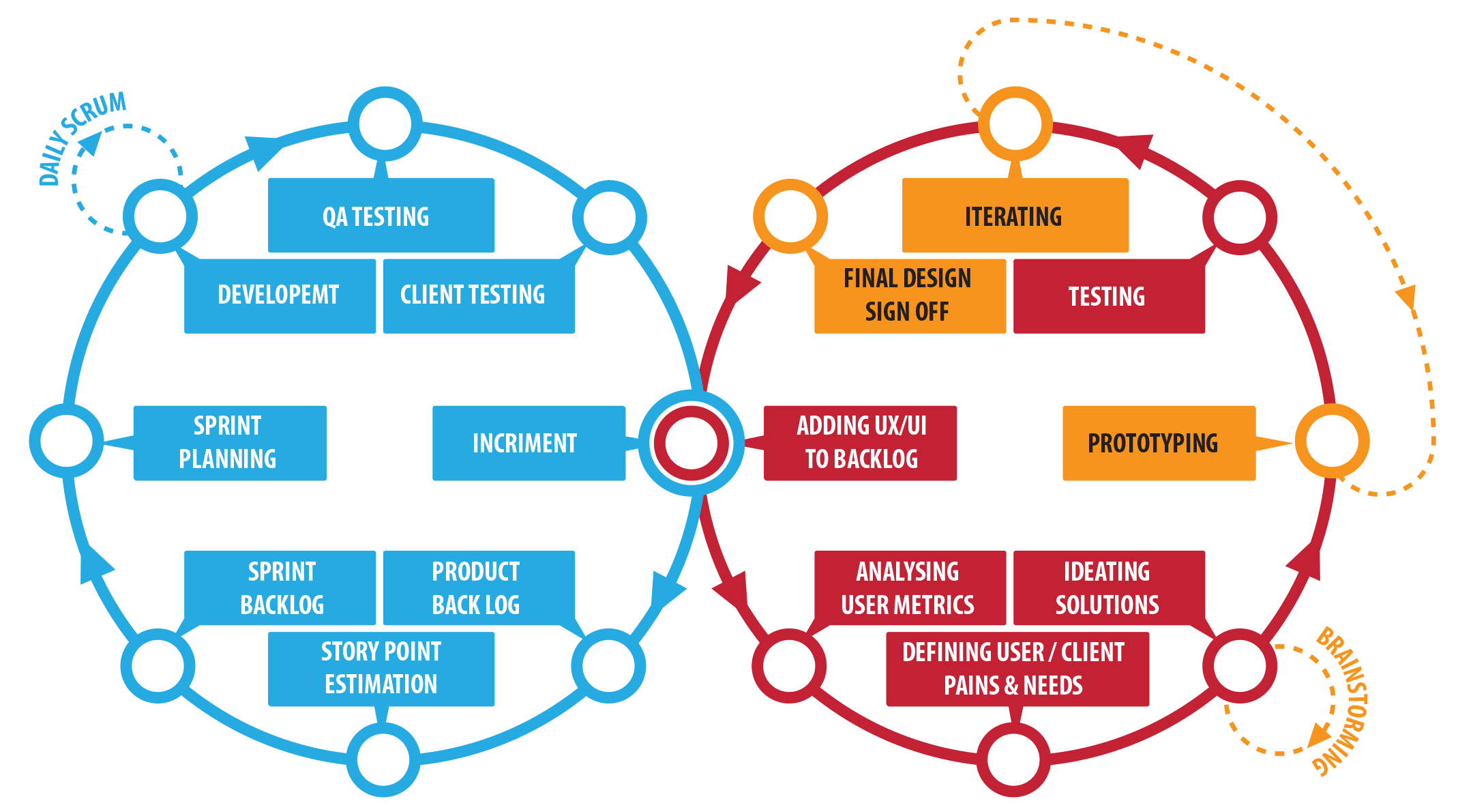
The Process
Before jumping into details and to shape th UX process I separated the product time line into four stages:
 Discover
Affordability research by gathering, organising and analysing the information about the existing users and bingo products.
Design
Designing, testing, branding templates and guidelines for the bingo UI product and sub-products.
Develop
Launching the MVP, testing, analysing, reiterating and converting the existing Native mobile to HTML5 and having one code base with the Tablet.
Grow
Continuous Agile development and UX cycle with expanding client portfolio, constant enhancements, regular testing, analysing user metrics and adding new features.
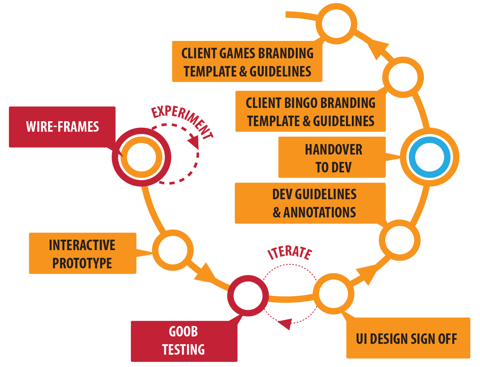
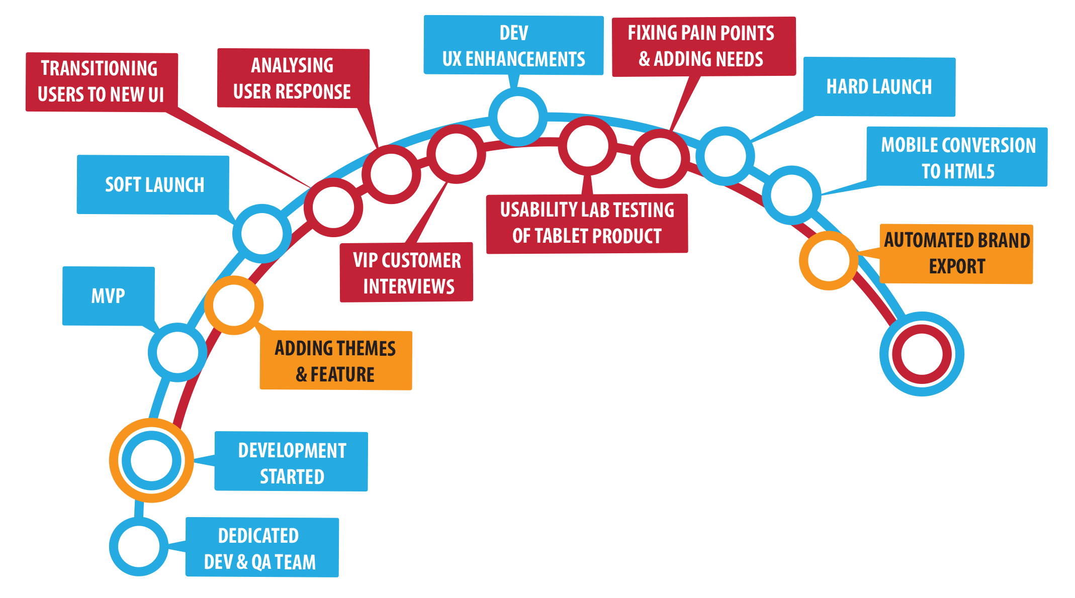
A Lean UX Machine
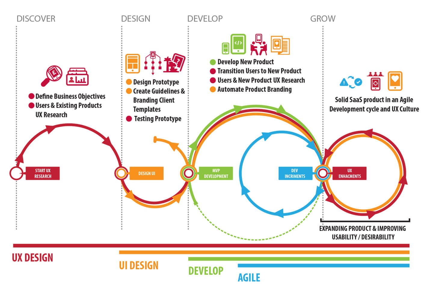 SaaS Bingo Product Timeline
Discover
The project started on a small scale. while keeping transparency across the organisation. As the project matured more relevant professionals where involved.
Regular meetings and activities where conducted; on-site and off-site, involving Business Analysts, Head of Bingo, Product Owner, Product Manager, Project Manager Head of Development and CCO to understand expectations, goals, technical constraints and works processes.
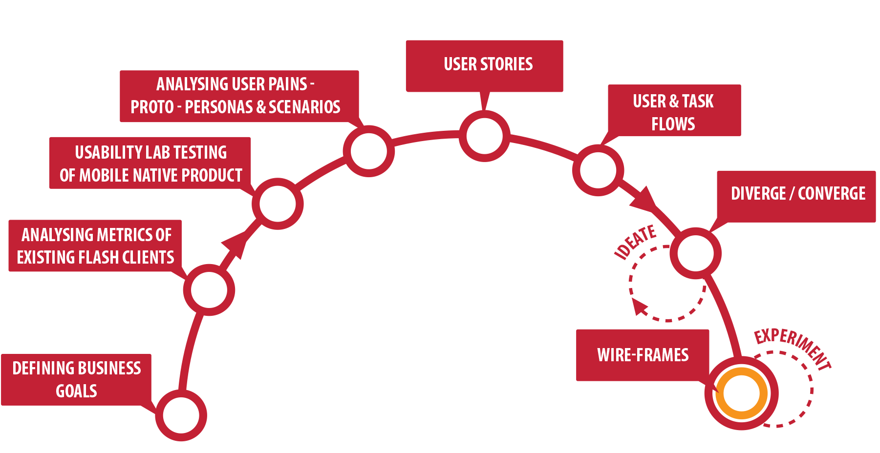
Defining Business Goals: The first step was about understanding ROI of the new product and putting together a road map to estimate how long it would take develop and release the product, in what areas does the company need to invest to achieve completion, risk assessment and how to minimise losing users of the existing product, what steps should be undertaken to switch the product medium and technology and how to would the product be valued in relation to competitors.
Analysing User of Existing Products: To understand who we will be developing the new product to we had to grab every data we could about the users of the existing product. In order to do so customer services shared with us the customer complaints and inquiries, we also interviewed chat admins and looking for keywords( how, where, when, why, frustrating, sad etc..) in the chat logs, and extracted the user matrics to understand user behaviour and user frictions.
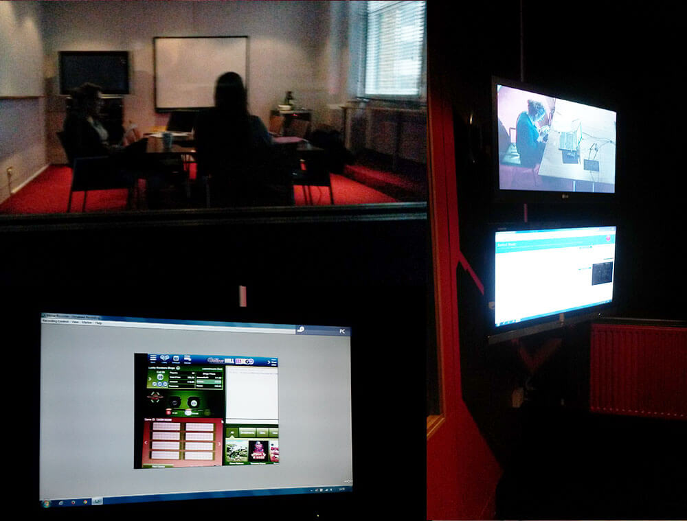
Usability Testing of Native Bingo Product: Conducting usability testing in a stimulated Lab testing environment powered us to emphasize more with the users of our products. The qualitative data gained gave a valuable insight to understand the users, motivations, friction, needs, pains, mind maps, habits, hobbies, brands and background.
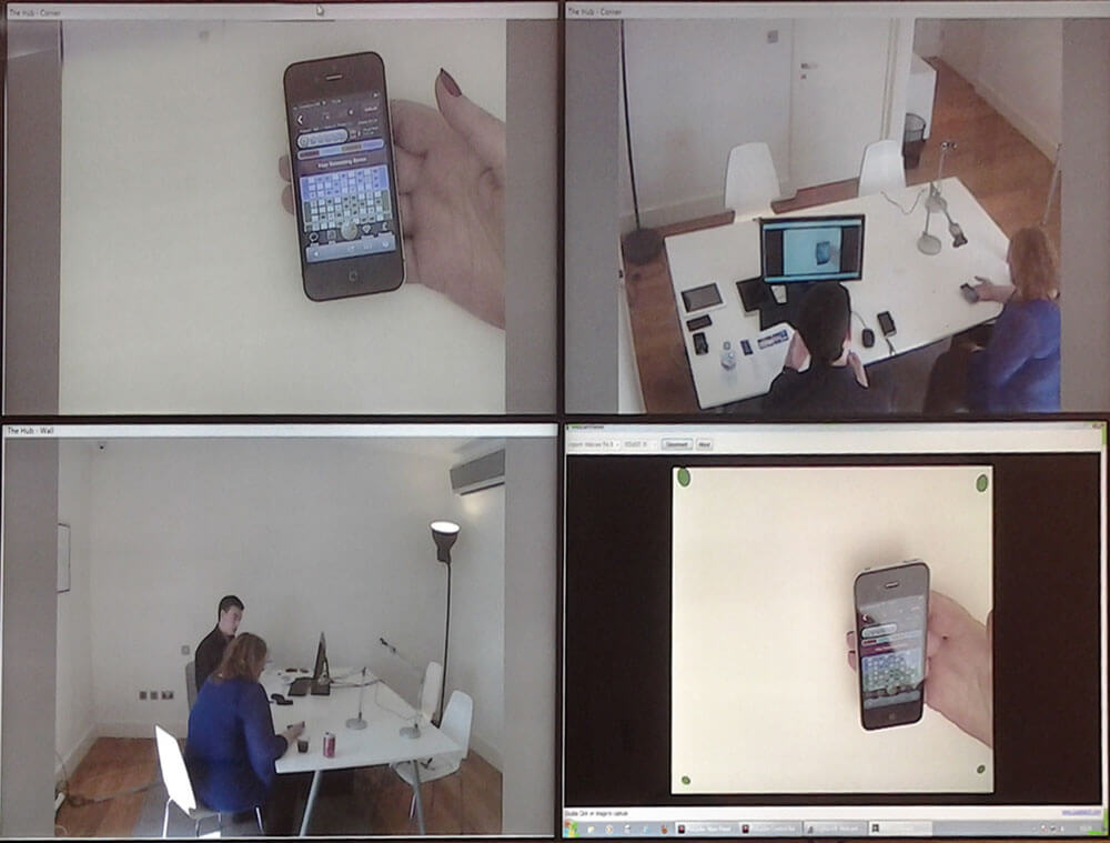 Native Mobile Usability Lab testing
 Notes from the tablet usabiliy testing
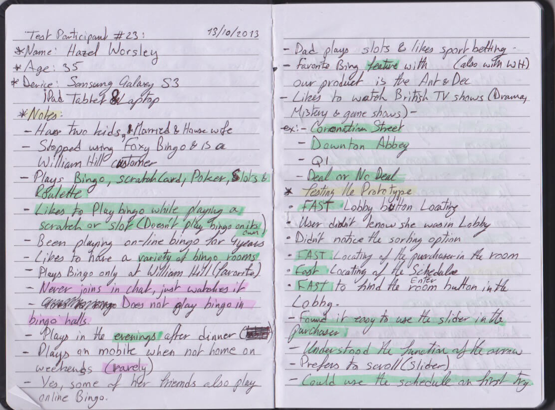
Generating Heuristic Personas: We combined, organised and categorised the qualitative and qualitative data we gathered from all our research on a spreadsheet. While inputting the information we started creating tags for the patterns we found ex: Demography of the users, when do users play bingo, how much do users bet on each game and in what intervals, users who play slots while playing bingo, etc. Since the female users were more than three-quarters of the users we generated five Personas, four female personas and one male persona. The personas had different needs, desires and pain points and segmented according to betting habits and frequency of playing bingo on our platforms. We share the personas with other departments and did a few tweaks on them after getting feedback. Note: We refined the set of Personas after usability tests were performed on the new tablet product.
 Ticket purchasing User story
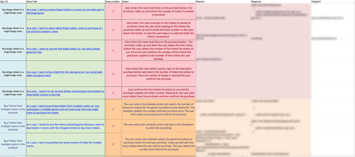
User Stories With the persons stuck up on the wall in one the of the "Town Hall" meeting room, we collaboratively started composing and filling up the walls with user stories to understand where might the users experience friction, where can we create automation, where do we need to include messages, what elements in the UI need to be visible or accessible at all times, what sub-tasks would the users perform. Once a user story was at a satisfactory stage we added it to Excel sheet and shared it with the developer.
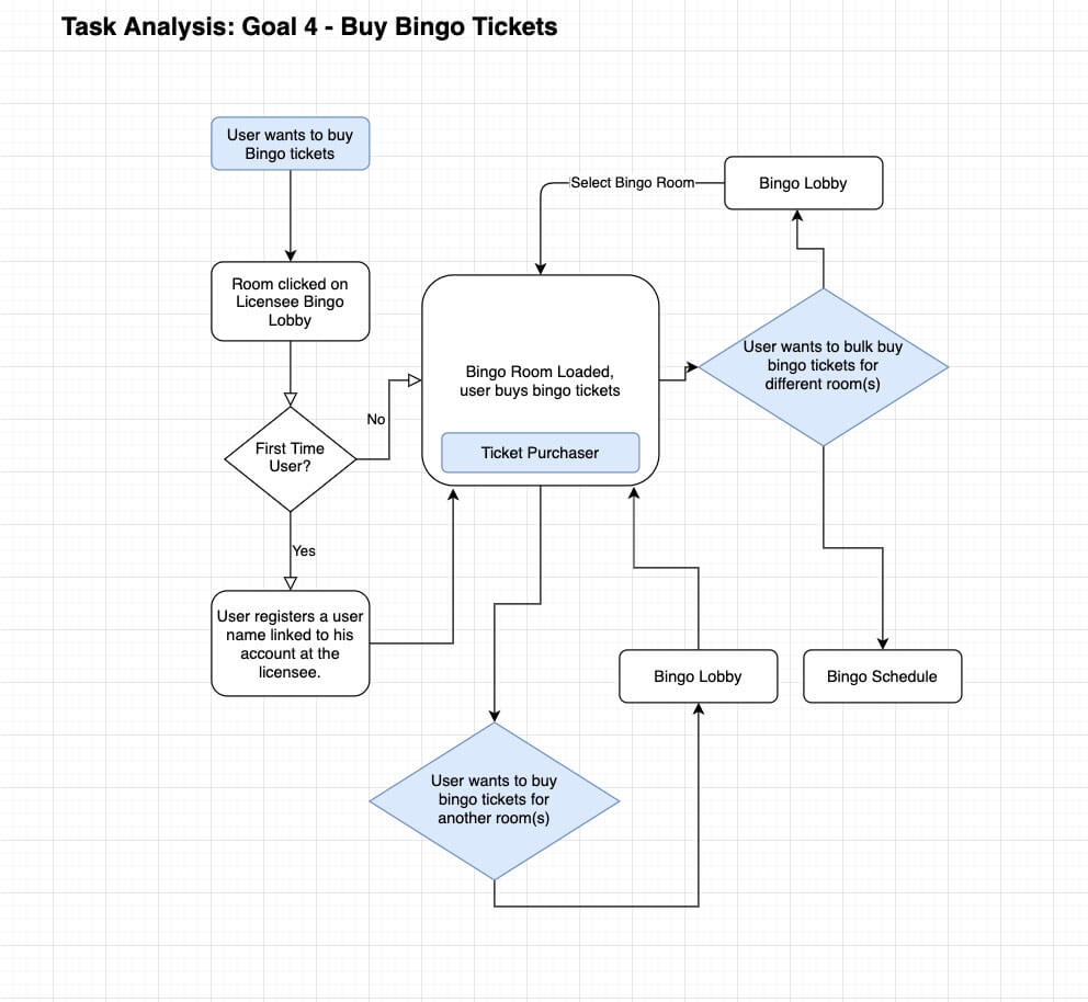 Task Flow ticket purchase
User Task Flows: After user stories passed the acceptance criteria, I and the Product Manager started creating User Task Flows. The user task flows variations done did not only cover the user end goals, but it also included mico-tasks. For example, the user reached the end goal of buying tickets and playing the bingo game, what mico-tasks can the user still perform during the bingo game? A Mirco-task can play a slot, chat with other users, add bingo buddies. The user task flows made it clear what possible interactions would the user be able to perform as any stage. It also gave us insights into how to navigate users through tasks with positive and negative reinforcements. An example of positive enforcement would be a confirmation message to the payer that they accomplished a purchase, whereas negative enforcement would be a confirmation message to the player that they have not selected tickets when trying to confirm a purchase.
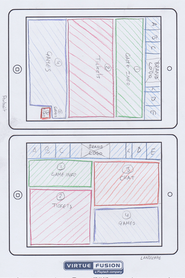
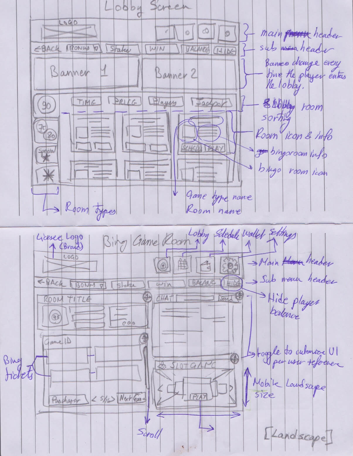 My first UI sketch during the Divergent Session with which I proposed a personalised
UI according to user interest / priotity
My first UI sketch during the Divergent Session with which I proposed a personalised
UI according to user interest / priotity
Divergent and Convergent: With the knowledge and processes at our disposal we had a good idea where the product has to be. With all the excitement we started with Divergent thinking which was about brainstorming while thinking broadly, keeping an open mind, considering anything and everything. We took turns on the whiteboard, sketching ideas and enacting users. It was theatrical and with a lot of sweets in the meeting room to boost our creativity. Some ideas where using device accelerometer, voice commands, using the bump feature to move your ongoing game from one device to another or creating a customisable personalised UI each user can rearrange the UI according to their interest. Convergent thinking is coming back to reality and thinking narrowly, bringing back focus and identify major key problems and feasible solutions. We had their categories for the ideas, Impossible ( due to technical constraints, the risk factor of unexpected results, too costly to develop or does not satisfy enough the user needs), possible ( might be revisited in the future) and must have.
- Creating a product road-map, mile-stones and deliverables with what temporary technical constraints we faced.
- Identifying the business requirements and how the UX would contribute to the success of the product.
- Creating heuristic evaluation personas to emphasise with the target users and guide me through the UI Design process.
- Generating User stories and user tasks to understand how to simplify, automate and shorten the user journeys for the user to achieve their intended goals, tasks and the sub-tasks
- Set the deadline for the MVP with the transition period to one year
Discovery Conclusion
Design
In this stage, if the project the most involved professionals where Designers, Product Manager, Business Analysts and Head of Development.
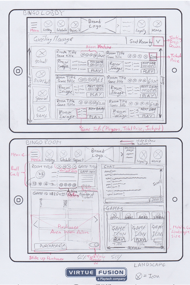
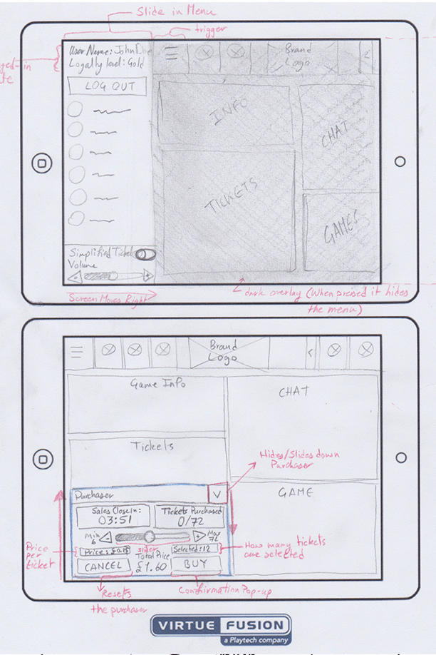
Wireframes: After we understood to a level how to emphasise with the users of the product and got some ideas to form the divergent and convergent sessions, I started designing the User interface to accommodate the needs, desires and pain points of the users. We aimed at creating a UI with clear CTA buttons, simple to navigate through and clear messages to avoid cognitive friction. At the same time, we had to consider the technical constraints and the lightness of the product.
Prototype: Once we had the UI design wireframes in a good place I created a low-fidelity prototype to test it internally and to evaluate the user flow of the prototype. After we received feedback we evaluated the points and concluded a few iterations in the User Flow.
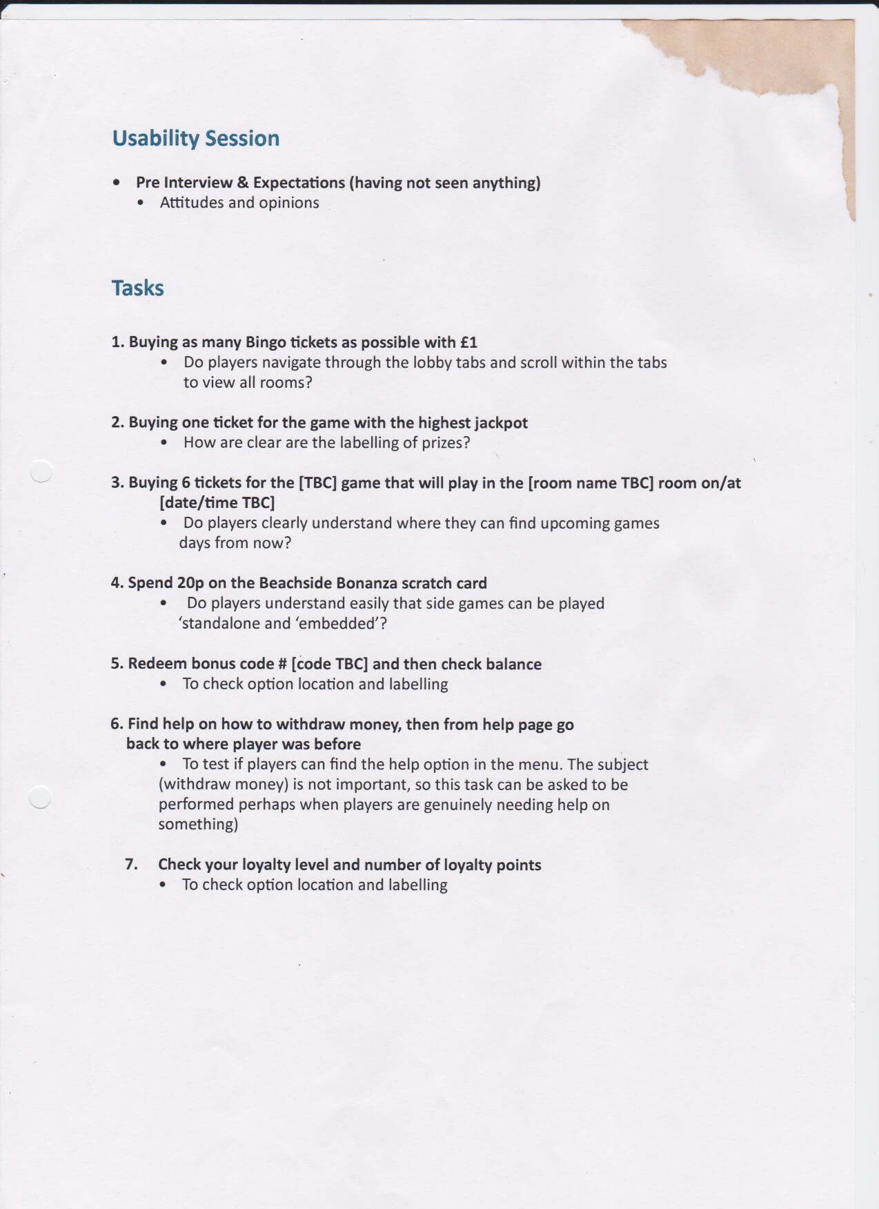
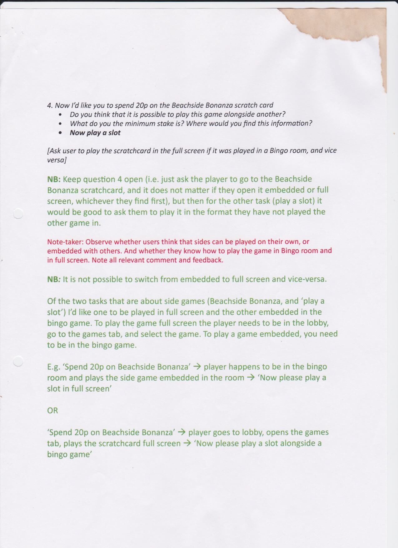
GOOB: Although the product was tested internally before we handed over the designs to the developers we performed a Get Out Of the Building (GOOB) Guerrilla usability test on real users. The Product Manager organised and acquired permission at the nearest Bingo hall ( Mecca Bingo, Camden) to set up a post where we would conduct the usability test. The design team prepared a fake brand for the UI and collaboratively with business analysts prepared the major task-oriented scenario that users can grasp easily, besides that, we added a checklist to evaluate how well where the tasks performed. We booked a meeting room and did a test run before the Product Manager and a Designer went out into the wild equipped with e voice recorder. The Product Manager and a designer managed to test the prototype on seven participants with sessions lasting from 8-11 minutes. We acquired from the usability testing information about user friction within the tasks and the clarity and ease of use, furthermore, we got some interesting insights in scaling elements and adding more notification about upcoming bingo games.
 Native Mobile Usability Lab testing
 Notes from the tablet usabiliy testing
 Notes from the tablet usabiliy testing
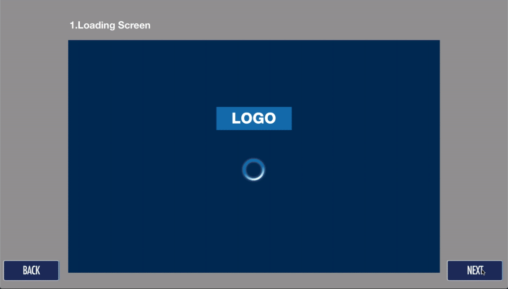
This paper prototype became the point of departure on the way to the more refined white-labelled interface, which we later implemented on desktop and tablet and started testing with the users.
UI design sign-off, Dev Guidelines, Annotations and Handover: The Core UI design, guidelines and annotations were signed-off by the Product Manager, the Spec signed-off by the Senior Business Analyst. The Head of Dev assigned a part of the developers into groups of Front-End, back-end, system Opps, and Java Developers and provided them with comprehension of the MVP specs they are working on. At this time not all developers could work on the project as a part of the development team had to still maintain and run the existing Flash client.
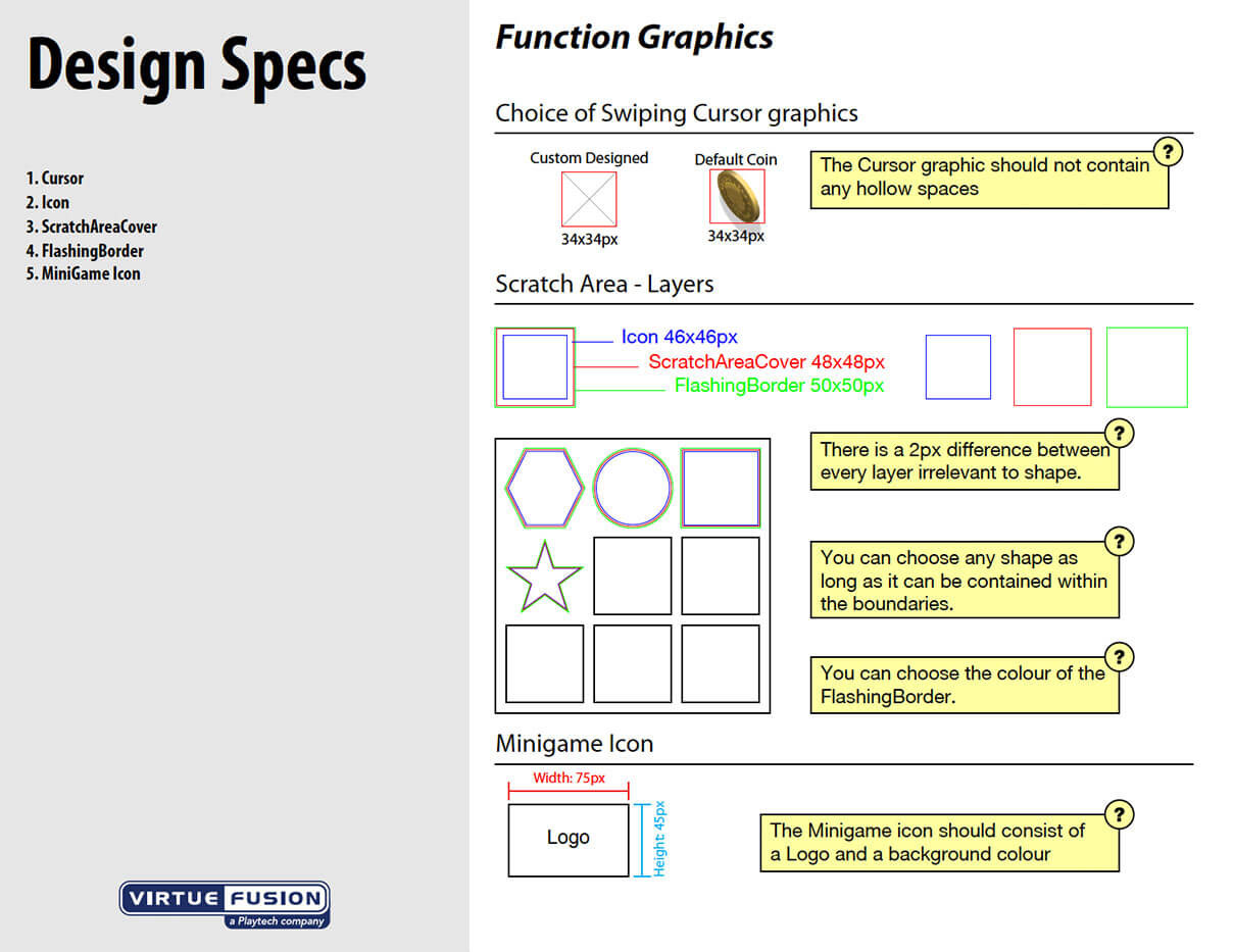
 Branding Template
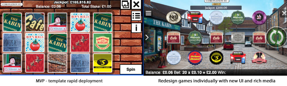
Client Games Branding Templates and Guidelines: Since the old bingo client was converted from Flash to HTML5 all the games which were hosted on the Flash client had to be converted with it. In order to achieve a fast conversion, I created templates an guidelines for Slot, Scratch Card and Arcade game. This made it possible to release tons of games along with the Tablet product release. Having the templates and guidelines gave the advantage of giving the option to the operators to brand the games themselves. The disadvantage was that the users raised a complaint during the VIP interviews that the games didn't have unique features and most of them are the same games just different themes. This issue was resolved during the Grow phase when the games were reworked individually one by one to provide richer game experiences, in addition, the option of serving third party games was developed into the client. Thereafter, the users had a great variety of games to enjoy during a bingo game or in the lobby.
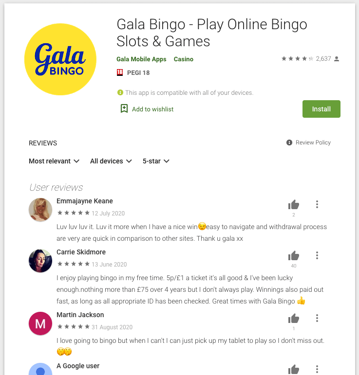
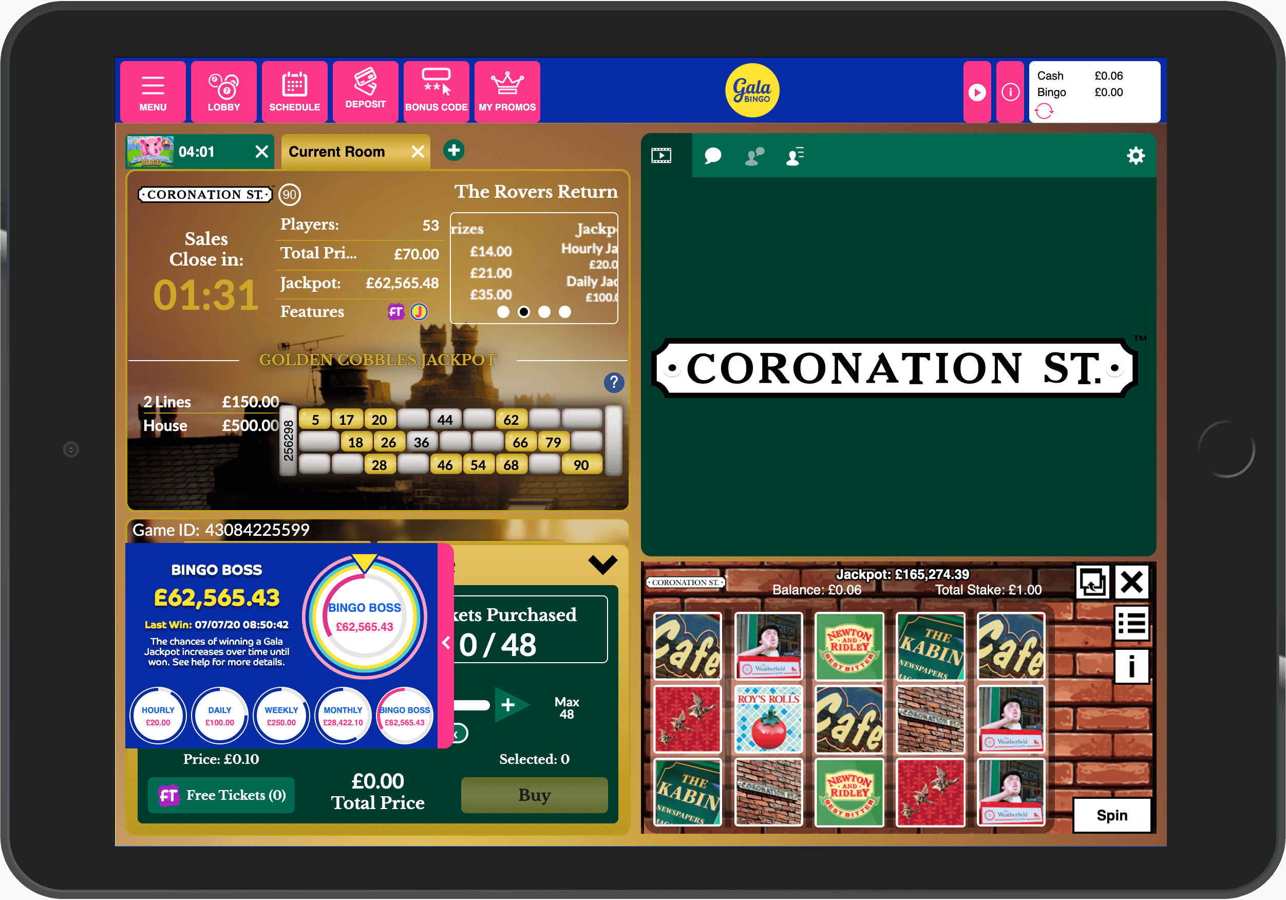
Client Bingo Branding Templates and Guidelines: After the UI was signed-off and handed over to start development, templates and guidelines were designed for the operators to brand the UI.?Gala Bingo?was the first licensee to receive the branding package from us and who gave us feedback about the ease of use and clarity of the templates and guidelines we provided.
Client Games Branding Templates and Guidelines: Since the old bingo client was converted from Flash to HTML5 all the games which were hosted on the Flash client had to be converted with it. In order to achieve a fast conversion, I created templates an guidelines for Slot, Scratch Card and Arcade game. This made it possible to release tons of games along with the Tablet product release. Having the templates and guidelines gave the advantage of giving the option to the operators to brand the games themselves. The disadvantage was that the users raised a complaint during the VIP interviews that the games didn't have unique features and most of them are the same games just different themes. This issue was resolved during the Grow phase when the games were reworked individually one by one to provide richer game experiences, in addition, the option of serving third party games was developed into the client. Thereafter, the users had a great variety of games to enjoy during a bingo game or in the lobby.
Develop
Agile development already started in this phase of the product time-line, yet, during this phase, the product and the UX design were maturing to reach the?Apex of the Agile Cycle.
MVP: Keeping the Development team on track with the UX research in addition to providing them with the UI designs, Annotations, product specs made the MVP development commenced smoothly.
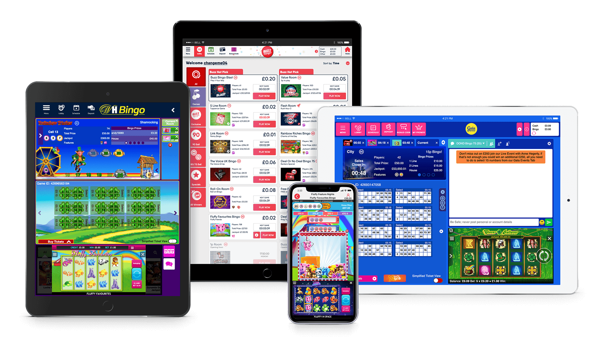
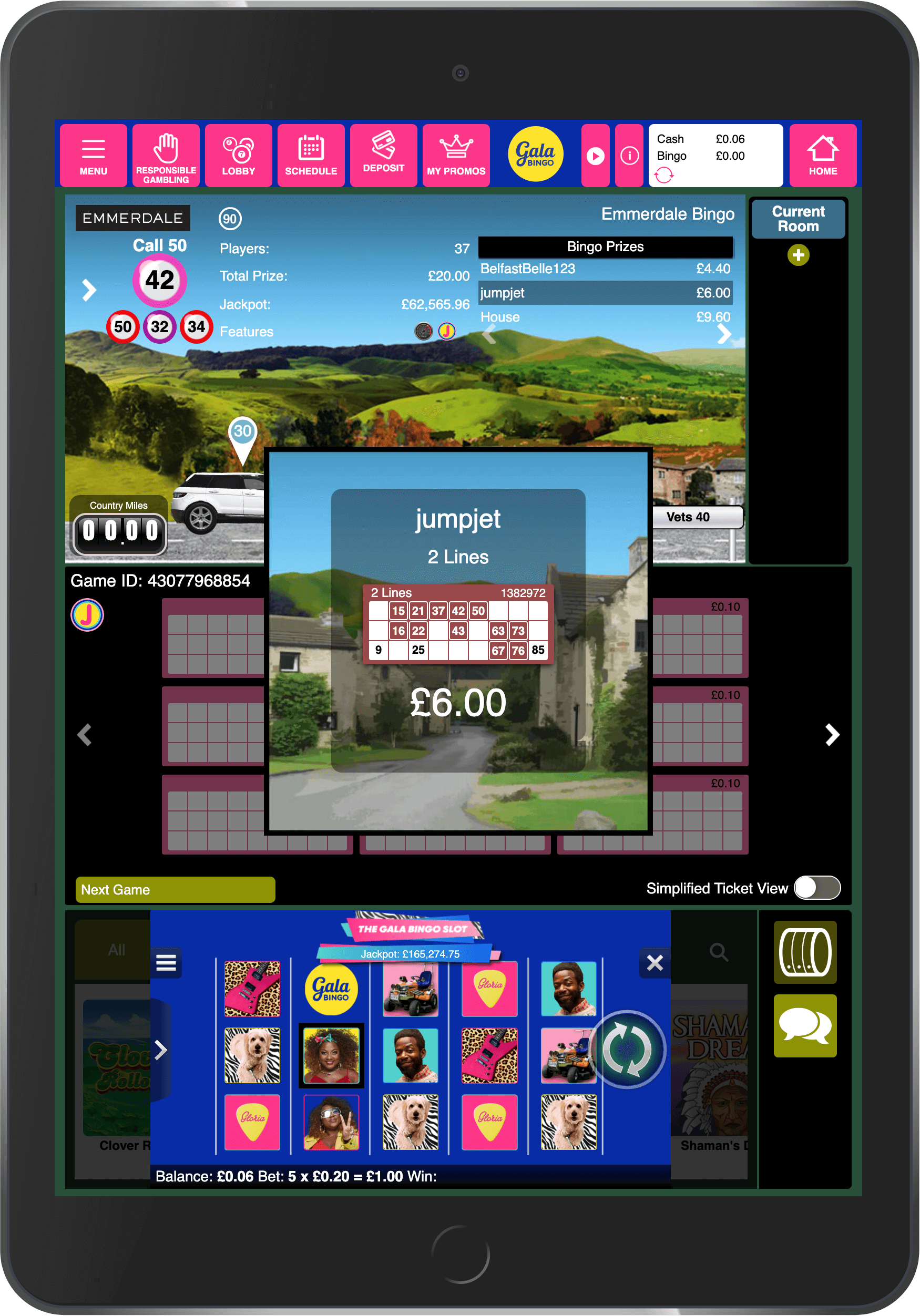
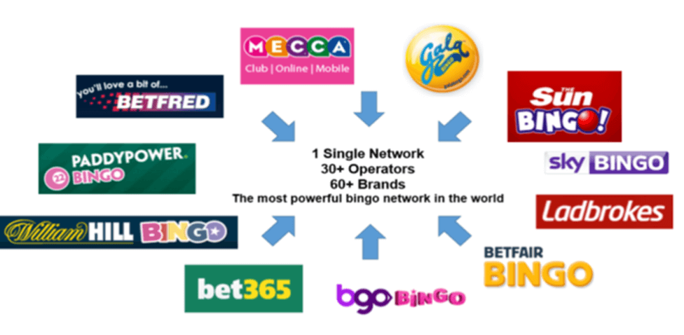
Soft Launch / Transitioning Users to New Product: The MVP was launched with Gala Bingo, William Hill and Mecca Bingo operators with the option for desktop users to pick between the old and new product. This was done in order not to overwhelm the users with a completely new product and let them explore it.
After launching with the first three operators we got the chance to track real user behaviours and measure the user metrics. Account Managers also provided us with customer inquires from the operator's customers services and the chat admins. We looked for similar inquires and prioritised them according to urgency.
VIP customer interviews / Usability testing of Tablet Product / refined personas: Me a business analyst and the Head of Bingo got invites to attend a Gala Bingo event for VIP customers held in Manchester, UK. We considered that an opportunity for us to approach the users directly and ask them about the product. The Head of Bingo arranged to book a room on the ground floor in the hotel where the event was held to invite the VIP users. The users were granted bonuses for their time. We also learned that the users were not very happy with the MVP slot game included in the Bingo Product.
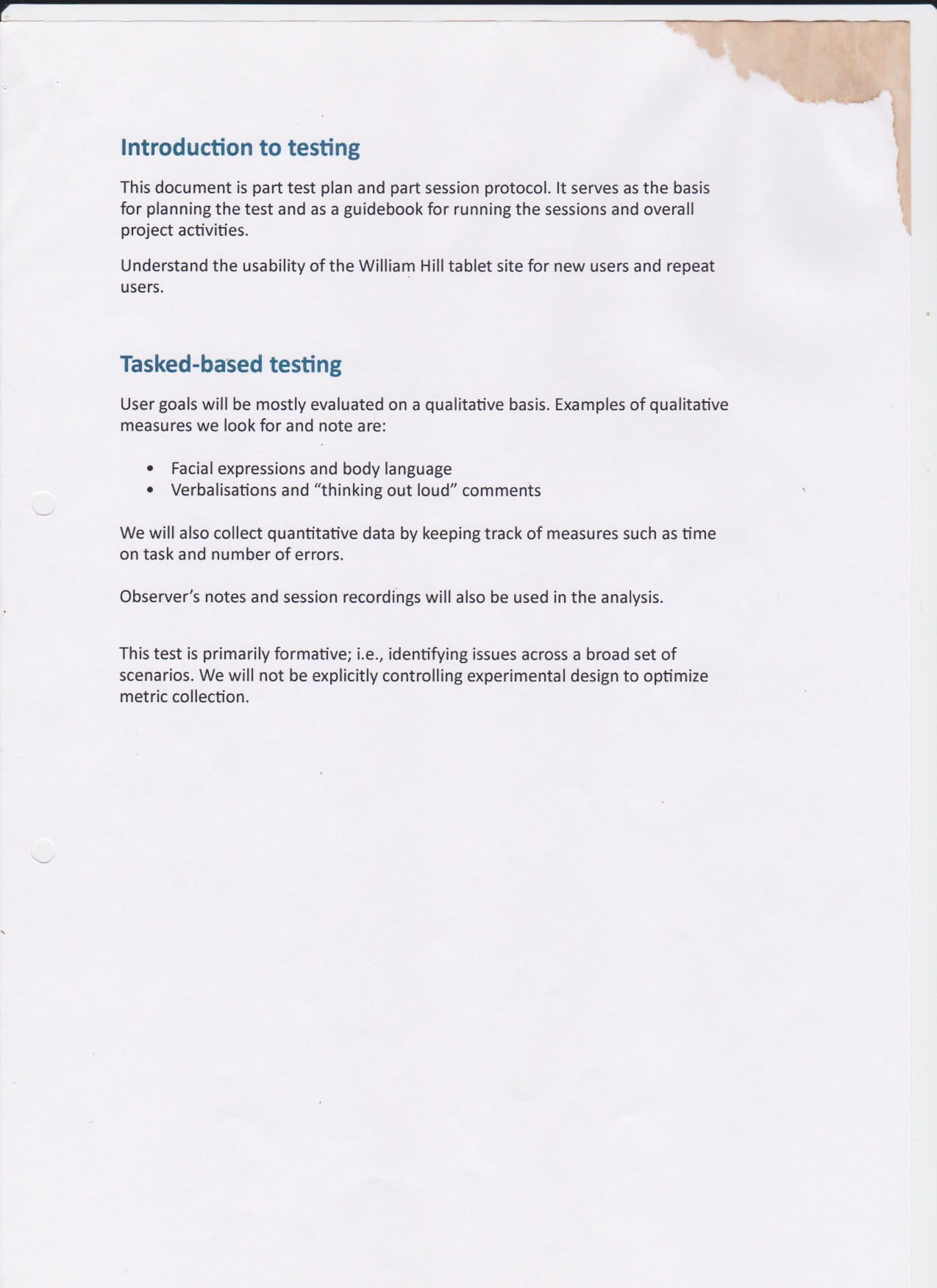
 Usability Lab Testing of the Prodcut
On another occasion, we performed a Usability Lab testing on the Tablet product with an external testing Lab located in Shoreditch, London. participants were a mix of new users and repeat users given primary tasks to perform, asked about their backgrounds, the gambling services they use, how they feel about the bingo games.
- Identifying user frictions in the user flows
- Measuring success rate, the time a task requires, the error rate, and users' subjective satisfaction.
- How we could develop more themed bingo featured rooms based on user interests (TV shows, TV series, celebrities)
- How can the users be able to play multiple bingo games and switch between bingo rooms more easily
- How can we improve the desirability of the product so users would switch from being loyal to operators to platform
- How to Include more user controls in the product
- How can we enhance the chat features in the product.
After the interview, the usability testing and tracing user metrics on the tablet product, we had a more clear picture of what are the next steps of making the product more user-centric. We returned our previous heuristic persona to reflect more the real users of the tablet product.
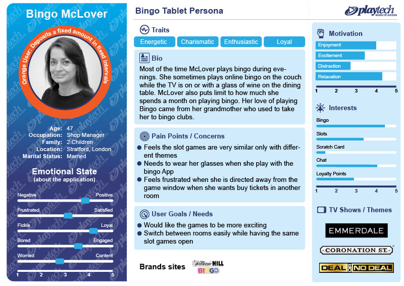 Refined Persona after Tablet interviews and usability Lab testing
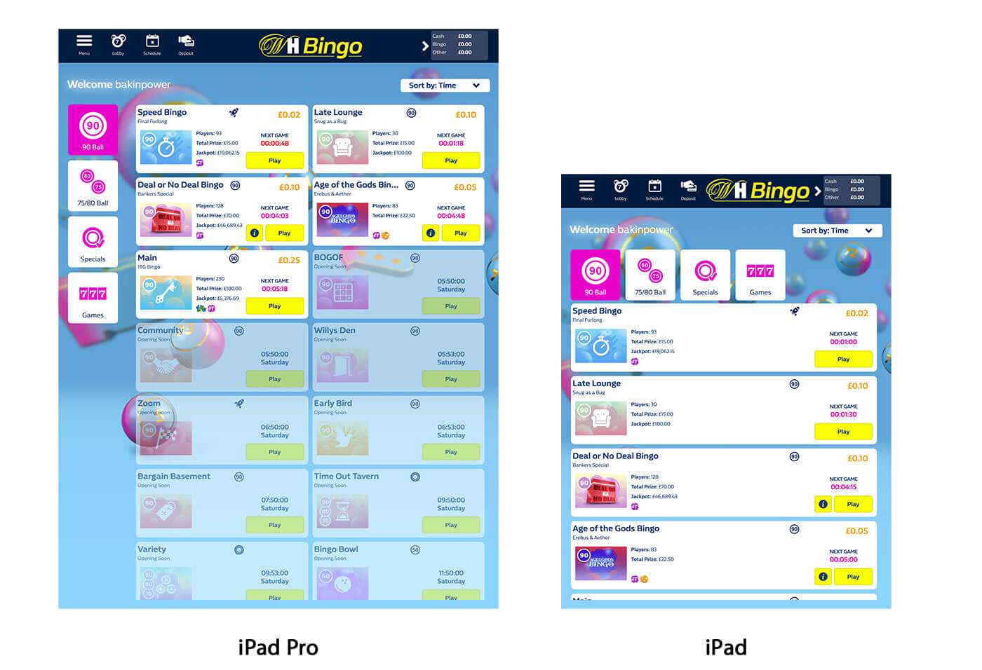
 Wrapper added to the App Stores
Hard Launch: The product matured, and the UX and development processes became more of a routine to launch the product across more operators. The branding was done with two operators per sprint. Now that the product was running with more operators the organisation had to expand its departments. I had to add two more designers to the team to be able to keep up with designing new feature rooms and adding enhancements. Moreover, the web app was placed with a Wrapper so it could be launched as an application through pressing an icon on the mobile interface. Other than being able to download the application for the operator's website, some operators added the wrappers to the Google and Apple App Stores.
Mobile Conversion to HTML5 / Automated Brand Export: With the product being stable and mature the organisation was ready to switch the native into HTML5 and merge the style code with the tablet product. This move freed up a lot of design and dev resources. Subsequently, as the code base was one it was possible to create one a branding template for all devices. I delegated putting together a template to the new UI designer and collaboratively with the developers, a JS script was coded to automate the export. This also freed more time and effort in deploying brands.
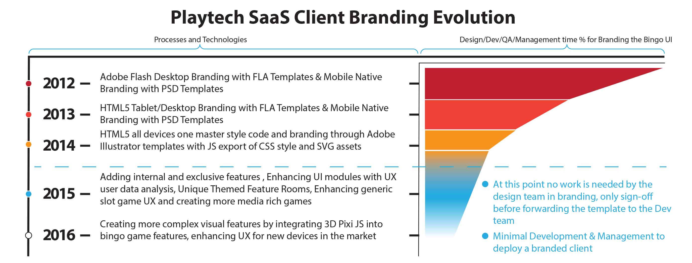 Branding Template evolution
- During the development phase we achieved a lot of UX milestones in shaping up the product to be more user-centric, below are some key solutions to customer pains and needs:
-
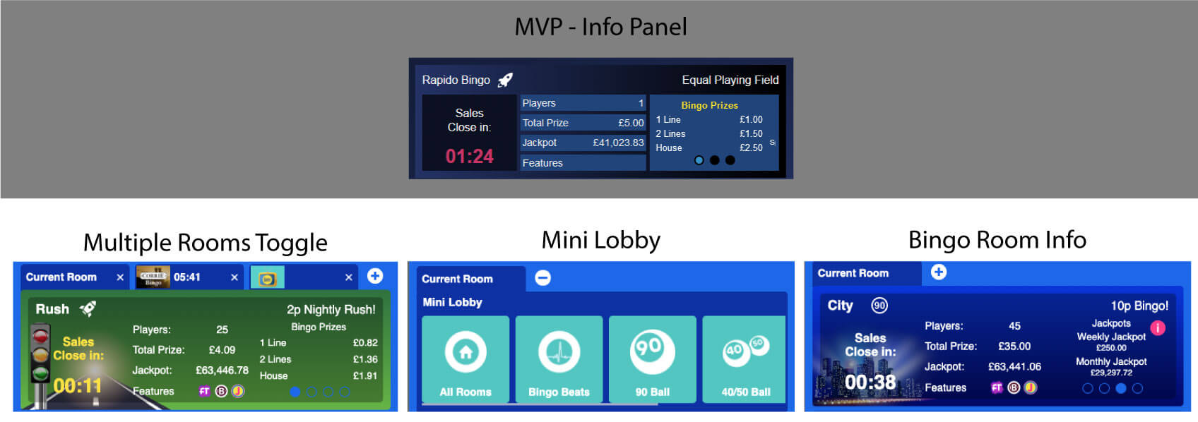
Pain: It took too many steps for the users to switch between rooms in which they bought tickets or are interested in.
Solution: Mini-Lobby added to the game info section which facilitated for the users to play multiple bingo games and be able to switch between the rooms.
-
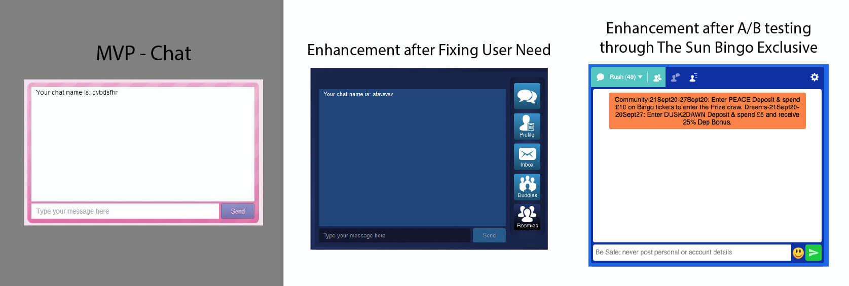
Pain: Users couldn't see if friends or bingo buddies playing and in which rooms.
Solution phase 1: We added features to he chat room for the user to be able to send mail to the chat admins, create a profile, upload a profile picture and create a contact list for roomies they linked to or add buddies they can chat with privately.
Solution phase 2: A different chat UI element was exclusively designed for The Sun Bingo UI. After, analysing the user metrics from The Sun Bingo operators, we came to the conclusion that the exclusive chat design was more favoured by users. Once the exclusivity ended with The Sun Bingo the new chat design was rolled out to all the other operators.
-

Pain: From the user profiles and notes of the usability testing, we found out that some users had trouble reading content in the chat dialogue box due to age and eyesight. In addition, we found some users prefer female voice callers over the default male one.
Solution: We created a settings widget which can be accessible from the slide-in menu or the chat top right corner. With the widget, the users were able to change chat window font settings, change the bingo ticket dabber colour and shape, change the voice of the bingo callers, notification settings, and bingo ticket settings.
Develop Conclusion
Grow
The product reached a level of maturity that now it became a perfect Agile & UX cycle in which the product is continuously developed, tested and enhanced to become more use- centric, and to satisfy the needs of the users. In the process, we created more exclusive and non-exclusive features, at the same time working on the desirability of the product. The sucess of the product shined with gambling market leading operators.
The designers got the hang of the Tablet design and were able to work with the business analysts independently. At this point, my role was to ensure consistent production standards while tracking project progress, delegating work, and addressing designer roles in different projects. I also had to ensure that designers are meeting deadlines and are in line with the developers.
My collaboration with the Product Manage consisted of going through the backlog after every sprint and prioritising UX design tasks depending on the Release schedule, Importance of client, Dependency on Dev, the weight of the project, and availability of designers. Once the tasks were chosen we took part in Story Point Estimation meetings and measured the Dev work needed to execute the UX enhancement. Usually, we schedule the UX enhancements 3 sprints ahead, but sometimes we might have to rearrange the work if there would be an urgent fix.
 High street operators use the product
We constantly received user metrics; through an internal system, of user interaction on the product from different operators. Similar patterns through different operators signify that attention is needed on the core UI. Irregular patterns signify that attention is needed on one operator's service. The patterns might be positive or negative. If the pattern is negative we try to resolve it and if the pattern is positive then we adopt it across other operators.
- Once the product reached the Grow phase the Agile and UX aligned perfectly in a cycle and the main focus became how to enhance and work on the desirability of the product. Below are some UX key solutions to user needs and pains:
-
Pain: The mini slot and scratchcard games in the Bingo product where too blend and did not have many features.
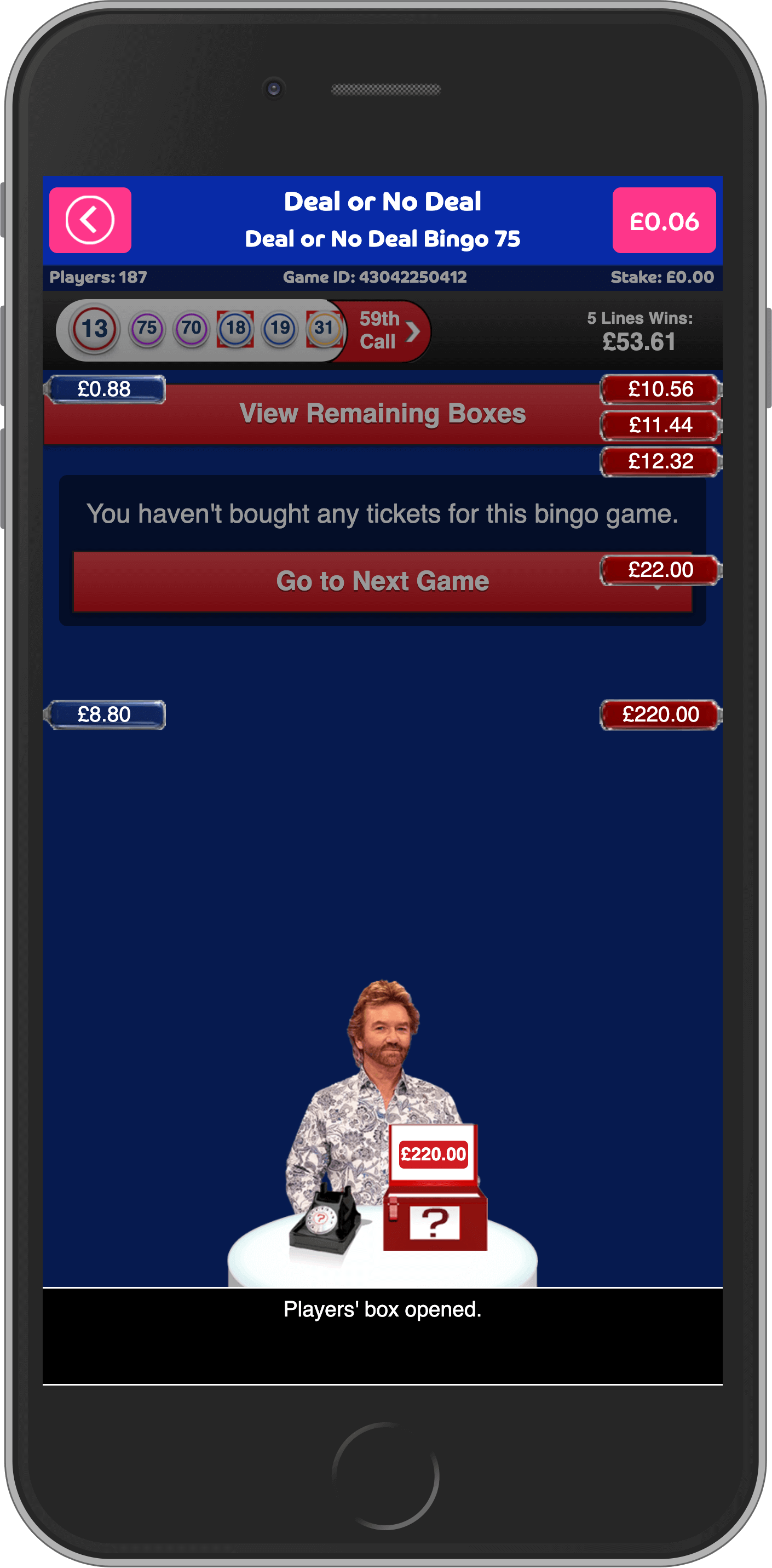
Solution: Enabled users to be able to play Playtech casino and third party slot game providers in the bingo rooms and the bingo games lobby, in addition, reworked the MVP games individually to make them more media-rich.
-
Pain: Users did know when their favourite bingo games start without exiting the room.
Solution: Added slide-in notification to inform players about starting games, bonuses, updates and the status of their purchased tickets in the bingo game.
-
Pain: Users did know when their favourite bingo games start without exiting the room.
Solution: Added slide-in notification to inform players about starting games, bonuses, updates and the status of their purchased tickets in the bingo game.
-
Pain: Users wanted to play more than one slot/scratchcard games during an ongoing bingo game.
Solution: Added an undocking feature to the game section.
-
Technical: New tablet devices with larger displays landed in the market.
Solution: Rework the UI to accommodate larger displays to make the user experience richer.
Grow Conclusion
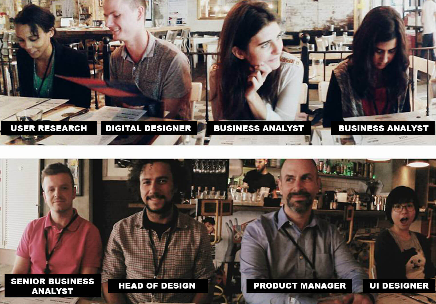 Much more people contributed to the success of the product, yet, these are the who I
worked the closest to
Much more people contributed to the success of the product, yet, these are the who I
worked the closest to Key Takeaways
My key takeaways were how to archive the UX quantitative and qualitative data, an internal UX Wiki would be beneficial in case research changes hands, can be a better reference for pushing UX enhancements into sprintsm also so other departments can have access to the information. Use newer prototyping tools for better sharing and collaboration .
Working with great people on a project with this magnitude was an inspirational career experience, I am grateful for the opportunity and proud to have worked on something which got a lot of appraisals from users, competitors and partners. I'm thrilled to see how the product is in an ever-evolving cycle based on the backbone I left behind.